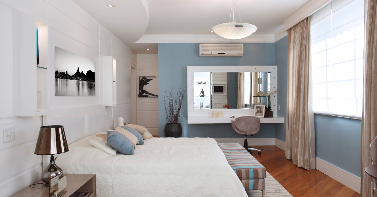
The process of creating a room’s color scheme begins with the creation of an abstract colour chart. This chart will be used to help in the final placement of a key colour and focus objects. The interior color and design process also includes the transfer of materials and colour charts to the final space. This phase consists of a number of steps, including the transfer of material chart samples and the creation of large space plans.
Principles of Color:
How colors affect human behaviour is called color psychology. This has long been used in art, advertising, and graphic design, and now is being applied to interior design. When used appropriately, color can enhance each space, thereby improving occupant satisfaction, productivity, and mood.
The meaning of interior color and design is often not only consideration, however. It is also important to keep in mind the purpose of the room, as well as the proportion of the hues. This is because color has more properties than just personal preference. In fact, certain hues can dramatically alter our moods.
Color has meaning, both biologically and learned. When a person sees a color, their brain evaluates its value and forces them to behave accordingly. Color psychology has made huge advances, thanks to scientists like Isaac Newton, who made first color wheel. Johann Wolfgang von Goethe also studied the psychological impact of color, publishing his “Theory of Colors” in 1810. And today, the impact of color has only increased.
Read Also: How To Choose Wide Collection of Sofa Set for Your Home
In addition to interior color and design, color psychology can be applied to the fine arts. This includes painting, photography, and advertising. It also plays an important role in culture. For example, many people associate black with darkness, while others associate it with elegance, functionality, and mystery. Black also has the advantage of being a neutral color and can be used for accents and walls.
Another important aspect of colour psychology in interior design is the way colour affects the mood of a space. Warm colours encourage socialization, while cool colours are calming. However, they can have the opposite effect, making the space seem cold and depressing. In addition, cool colours can also be used to create a business-like or utilitarian atmosphere.
Warm or Cool Accents of Interior Color and Design:
The color palette of a room can be divided into warm and cool accents. Warm colors are generally used for furnishings, walls, and accents. Warm colors make a room feel comfortable and cozy. They also make a room appear larger than it is. However, when it comes to choosing colors for small spaces, you should be mindful of how each color and its hue plays off of each other.
The color used for accents is usually proportionate to the primary color. It should be bold but not overwhelming and should complement the dominant color. Typically, accent colors are used for accessories, throw pillows, and art pieces. These colors only make up about 10% of a room but have the greatest visual impact. In addition, they give you the chance to make a bold contrast between colors.
In a high-volume establishment, warm colors increase the chances of visitors staying longer. However, they can also be irritating after a while. If you choose warm accents, choose a palette that is comfortable for you and your guests. Bright colors, on the other hand, can increase the turnover rate.
While warm accents are vibrant and playful, cool colors are calm and refreshing. Before choosing a color scheme, think about the room’s purpose. Is it for socializing or a relaxing space? You might want to go with warm colors in your social areas and cool colors for quieter spaces.
White paint colors with yellow undertones are warmer than those with blue undertones. If you’re choosing white paint colors, be sure to select ones that go well with the other pieces in the room. Remember to use neutrals as well. This helps to keep the space balanced.
Neutrals:
Neutrals are one of the most versatile colors in the color spectrum, and can be enhanced with a variety of complementary accents. When selecting accent colors, neutrals are best complemented with earthy shades, spice shades, and blues, reds, and warm shades found in nature. These colors can be used to layer one another and create a sophisticated and elegant look.
When choosing the color palette, keep in mind that a neutral color palette encourages the use of patterns and textures without making the room overly busy. However, the greater the contrast between two neutral colors, the busier the space will appear. For example, a space decorated with white-and-black patterns will look more energetic than one in which beige is the dominant color.
The neutral color palette can be divided into warm and cool neutrals. Warm neutrals are those that make a person feel cozy. They go well with natural tones, including earthy greens, and soft grey tones. You can use warm neutrals in combination with other colors to create a bold look.
Neutrals can also be used to create cohesion in large, open spaces. Browns and layered tons of white also work well together. Designers at House of Grey incorporate salutogenic principles into their interior color and designs, which is designed to create a healthier structure. However, if you want to go for a more subtle look, you can opt for a more traditional color palette.
Neutral colors can be made by combining any primary hue with a complementary color. Reds and greens are complementary to each other. Oranges and purples work well together too. If the colors aren’t complementary, they will appear unrelated to each other. You can use different combinations of colors and create an exciting palette that will suit your home.
Neutrals with Warm or Cool Accents:
Neutrals with warm or cool accents create a lively and varied look without overwhelming the room. Traditional decorating wisdom recommends paying close attention to coordinating finishes and colors. However, this is not necessary if you use neutrals. Contrary to popular belief, neutrals don’t have to be matched. Neutrals encourage a lot of variation, so you can use different shades of the same color in different areas of your room.
Neutrals that have warm or cool accents are a perfect choice for homes with original architectural detail. For example, you can choose sage green as the accent Interior Paint color in your living room or kitchen. A sage green accent can accentuate a traditional room or make it more dramatic. Benjamin Moore offers several shades of sage green to suit every style.
Warm neutrals make you feel cozy. They are easy to mix and match with contemporary furniture. For instance, the Gabriola Ivory Lounge Chair will look great on gray walls. Neutrals will also match natural materials. Whether you use dark wood furniture or soft grey green bedding, the combination will work.
Neutrals with warm or cool accents give your room a sophisticated look. They blend well with muted earth tones and can be used as a foundation for other muted shades. Neutrals with warm or cool accents can work for any type of interior design.
The neutral shades are an excellent choice for a modern or classical style of home. These shades are soothing and promote positive feelings. For a classic look, you can even use marble mosaic tile with an old-world pattern in the bathroom or kitchen.


